


“`html
How to Build Your Mobile App’s First Screen
A Step-by-Step Guide
Your app’s first screen is the moment of truth. Users decide in seconds whether to stay or leave. Get it wrong and no amount of clever features downstream will save you. Get it right and you’ve earned the attention needed to show them everything else. This guide walks you through exactly how to build a first screen that holds users, backed by real examples and a repeatable process you can execute today.
Understanding Your First Screen’s Purpose
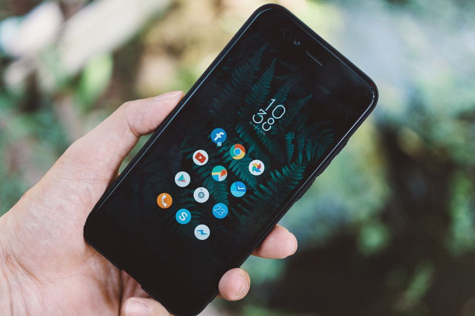
Your first screen does three things simultaneously: it introduces your brand, communicates value, and tells users what to do next. Most builders obsess over how it looks. The operators who ship winning apps obsess over what it does. Whether your app serves productivity, entertainment, or education, every element on that screen must serve the app’s core objective. Decoration that doesn’t direct is just noise.
Design Principles to Follow
This isn’t about making something pretty. It’s about building a screen that converts attention into action. Three principles govern every decision:
- Clarity: The app’s purpose must be obvious within two seconds. Use direct language and a clean layout. If a user has to think about what your app does, you’ve already lost them.
- Consistency: Every visual element — color, font, spacing — should reflect your brand identity. Inconsistency signals amateur execution and erodes trust instantly.
- Navigation: Users need to know their next move without guessing. Intuitive navigation isn’t a bonus feature. It’s the baseline.
Case Study: Slack’s Onboarding Screen
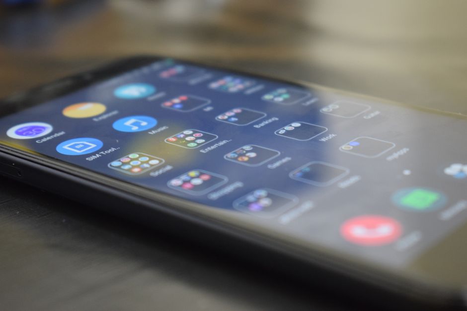
Study Slack’s onboarding screen and you’ll see restraint executed at a high level. Clean interface. Clear instructions. A direct path to setting up a workspace. No clutter, no confusion. Users move forward without friction because every element earns its place on the screen. That’s not an accident — it’s the result of deliberate decisions made by a team that tested relentlessly and cut everything that didn’t serve the user’s next step.
Tools and Resources to Consider
The right tools remove friction from your build process. Here are three worth knowing:
- Figma: The standard for UI/UX design. Starts with a free tier. Professional plans unlock advanced collaboration and prototyping features.
- Adobe XD: Solid prototyping capability for designers who already live in the Adobe ecosystem. Free version available; paid plans add depth.
- Sketch: A longtime favorite for its focused feature set and clean workflow. Requires a license purchase, but a trial period lets you evaluate it first.
Step-by-Step Guide to Building Your First Screen
- Define Your Goals: Before you open any design tool, write down exactly what this screen must accomplish. User engagement, brand introduction, immediate sign-up — pick your primary objective and design toward it.
- Wireframe Your Ideas: Use Figma or Adobe XD to map out layout and user flow. Keep it rough. You’re solving a structural problem, not a visual one, at this stage.
- Design the Interface: Apply your brand’s design system. Every visual choice should reinforce function. If it looks good but confuses users, cut it.
- Develop the Screen: Build it in Android Studio or Xcode. The design is only as good as the implementation behind it.
- Test and Iterate: Put real users in front of it. Watch where they hesitate. Collect that data and act on it. One round of testing is never enough.
Common Pitfalls to Avoid
Most first screens fail for the same predictable reasons. Don’t let these sink yours:
- Overloading with Information: More is not more. Every element you add competes for attention. Keep it tight and let the most important action dominate.
- Ignoring User Feedback: Your opinion of your own screen is the least useful data point you have. User feedback is the signal. Build systems to collect it and act on it consistently.
- Neglecting Performance: A slow-loading first screen is a dead first screen. Users don’t wait. Optimize load time before you ship, not after you see the drop-off data.
Next Steps: Bringing It All Together
Building your mobile app’s first screen is one of the highest-leverage decisions in your entire development process. Clarity, consistency, and user experience aren’t optional — they’re the foundation. Nail those three and you create a screen that earns the next tap. To go deeper on optimizing for user engagement, explore the resources on ArcanoLabs’ blog for additional strategies and frameworks.
Start now. Open Figma, sketch your first wireframe, and commit to iterating based on what real users show you. The first screen is where your app either earns trust or loses it. Build it with that weight in mind.
Checklist for Designing Your App’s First Screen
Use this checklist before you ship. Every item matters:
- Goal Alignment: Confirm the screen directly serves your app’s primary objective and user needs. If it doesn’t, redesign before you build.
- Brand Consistency: Colors, fonts, and logos must be accurate and deliberate. Inconsistency here signals a lack of attention to detail.
- User Onboarding: If onboarding steps are necessary, include them — but keep them short and purposeful.
- Call to Action (CTA): One prominent, unambiguous CTA. Users should never wonder what to do next.
- Responsive Design: Test across multiple devices and screen sizes before launch. Assumptions about display will cost you.
- Accessibility Standards: Screen reader compatibility and contrast ratios aren’t optional. Build them in from the start.
FAQs on Building Your Mobile App’s First Screen
Answers to the questions that come up most often:
- What are some common elements to include on the first screen? A clear welcome message, your app’s core value proposition, and one direct CTA. That combination sets the stage for everything that follows.
- How can I ensure my first screen is engaging? Strong visuals, concise copy, and interactive elements that feel purposeful. Then run user tests. Engagement data beats assumptions every time.
- Should I include a login or signup option on the first screen? Only if user accounts are central to the core experience. If you do include it, keep the process simple and optional for new users. Don’t create a wall before they’ve seen the value.
Key Performance Indicators (KPIs) for First Screen Success
You can’t improve what you don’t measure. Track these four metrics from day one:
- Conversion Rate: What percentage of users take the desired action — signing up, proceeding to the next screen, or completing onboarding. This is your primary signal.
- Bounce Rate: How many users exit after seeing only the first screen. A high number tells you something is broken — in the design, the messaging, or the load time.
- Load Time: Every additional second of load time costs you users. Measure it, benchmark it, and optimize it continuously.
- User Feedback: Qualitative data from reviews and direct feedback surfaces the problems your metrics can’t explain. Collect it systematically.
Case Study: Spotify’s User-Centric First Screen
Spotify’s first screen is a data-driven operation disguised as a design decision. Users open the app and see personalized recommendations built from their listening history. The result is an entry point that feels relevant from the first second. Spotify achieves this by feeding behavioral analytics directly into the interface — not as a feature, but as the foundation. That’s what a user-centric first screen looks like when a team tests relentlessly and lets the data lead.
Advanced Tips for Enhancing Your First Screen
Once the fundamentals are solid, these moves separate good screens from great ones:
- Use Animation Wisely: Subtle motion can guide attention and add polish. Overdo it and you slow performance and distract users from the action you want them to take.
- Implement A/B Testing: Run controlled experiments on layout, copy, and CTA placement. Let the data tell you what works. Your instincts are a starting point, not a conclusion.
- Use Analytics to Inform Design: Behavioral data reveals how users actually interact with your screen versus how you assumed they would. Build that feedback loop into your process permanently.
Conclusion: The Journey Beyond the First Screen
Your app’s first screen is not a finish line. It’s the opening move. Build it with clarity, measure its performance against real data, and iterate without ego. The operators who ship apps that last don’t treat the first screen as a one-time design exercise — they treat it as a system to be refined continuously. Keep testing, keep cutting what doesn’t work, and keep raising the bar. In a crowded market, that discipline is what separates apps that stick from apps that disappear.
Understanding User Psychology for First Screen Design
The best-designed first screen in the world fails if it ignores how users actually think. First impressions form in under a second. That’s not a metaphor — it’s a cognitive reality you’re designing against. Four psychological principles should inform every decision you make:
- The Principle of Simplicity: Users gravitate toward clean, uncluttered interfaces. Every element you add increases cognitive load. Add only what earns its place.
- Visual Hierarchy: Size, color, and placement direct the eye. Use them intentionally to pull attention toward your CTA and core value proposition first.
- Consistency and Familiarity: Users trust interfaces that follow established patterns. Deviating from convention without a strong reason creates friction and erodes confidence.
- Emotional Engagement: Color, typography, and imagery trigger emotional responses before users consciously process them. Design those elements to create the right feeling, not just the right look.
Apply these principles and your first screen stops being a design artifact and starts being a conversion tool. That’s the difference between building something that looks good in a portfolio and building something that performs in the real world.
“`


Leave a Reply